Preston Scott Cohen – Toroidal Architecture (Works)

Selected Works

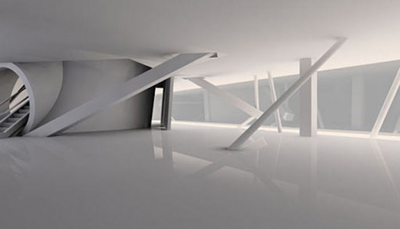
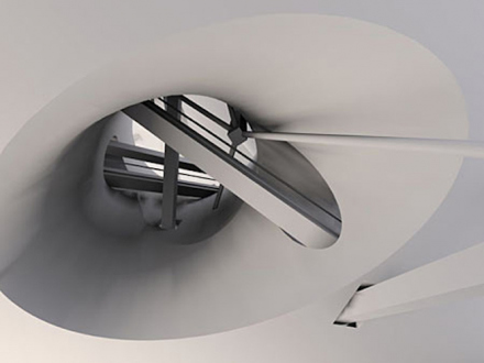
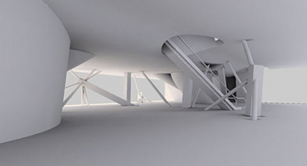
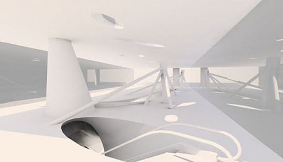
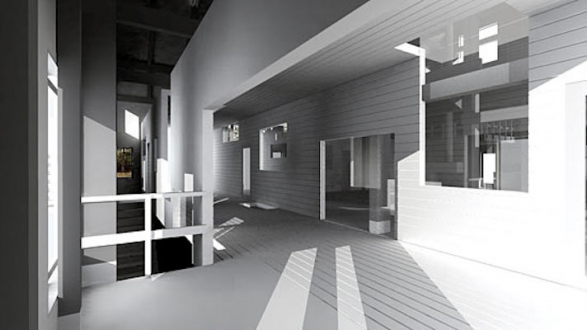
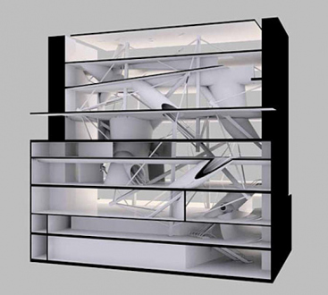
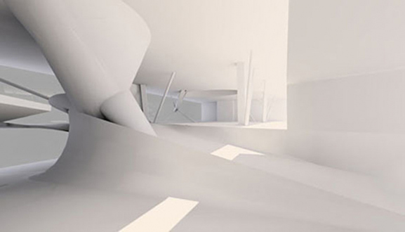
Eyebeam (Floor 0 - roof), 2001. Digital Duraflex print, edition of 6 (+2 AP), 13 x 24 in. This project aims to exemplify and accommodate emerging information technologies. Symbiosis of digital media and architectural space results in a kind of cat's cradle situation: reciprocal elements bound in tension. Two sets of seemingly separate horizontal spaces are toggled such that each appears to be extraordinarily thick mass from which the other is carved. The structural system is a space frame based on tensegrity, a force field of separate compression members held apart by cords in continuous tension: anti-gravitational, multidirectional and permutable. At once episodic and coherent, the totality of spaces and structure is locked in a double bind. It is not dialectical in the ordinary sense of opposing terms, e.g. virtual reality versus three dimensional spatial reality. On the contrary, it involves the coexistence of three-dimensional realities of equal status. Hence, it is hyper-dialectical. The computer enhances the capacity to introduce complexity, i.e. proportionality, into architecture. Whereas proportion designates a primary arithmetical system, proportionality designates a system of systems or analog. The predisposition of architecture toward analogical reasoning and formatting is intensified by the digital medium. Location: 540 West 21st Street, New York, NY Proposal for second stage of invited competition Project Credits Chris Hoxie, k+d.lab, Cameron Wu (renderings) Project Team: Preston Scott Cohen; Cameron Wu, Chris Hoxie Associate Architects: CR Studio Architects - Lea Cloud, Victoria Rospond (principals); Jon Dreyfous, Chris Hoxie, Jay Stancil, Sally Zambrano-Olmo, Kristin Enderlein, Adrienne Broadbear, Feliz Skamser Animation Production Design: k+d.lab - Dean D. Simone, Joseph Kozinski (principals); Brandon Hicks Virtual installation pieces by metaphrenie.com Video Production: Robert Michaels Consultants: Guy Nordenson (structural); Robert Heintges (curtain wall); Karen Sideman (curatorial) Eyebeam (Floor 0 - roof), 2001. Digital Duraflex print, edition of 6 (+2 AP), 13 x 24 in.


This project aims to exemplify and accommodate emerging information technologies. Symbiosis of digital media and architectural space results in a kind of cat's cradle situation: reciprocal elements bound in tension.


Two sets of seemingly separate horizontal spaces are toggled such that each appears to be extraordinarily thick mass from which the other is carved. The structural system is a space frame based on tensegrity, a force field of separate compression members held apart by cords in continuous tension: anti-gravitational, multidirectional and permutable.


At once episodic and coherent, the totality of spaces and structure is locked in a double bind. It is not dialectical in the ordinary sense of opposing terms, e.g. virtual reality versus three dimensional spatial reality. On the contrary, it involves the coexistence of three-dimensional realities of equal status. Hence, it is hyper-dialectical.


The computer enhances the capacity to introduce complexity, i.e. proportionality, into architecture. Whereas proportion designates a primary arithmetical system, proportionality designates a system of systems or analog. The predisposition of architecture toward analogical reasoning and formatting is intensified by the digital medium.


Location: 540 West 21st Street, New York, NY
Proposal for second stage of invited competition


Project Credits
Chris Hoxie, k+d.lab, Cameron Wu (renderings)
Project Team: Preston Scott Cohen; Cameron Wu, Chris Hoxie
Associate Architects: CR Studio Architects - Lea Cloud, Victoria Rospond (principals); Jon Dreyfous, Chris Hoxie, Jay Stancil, Sally Zambrano-Olmo, Kristin Enderlein, Adrienne Broadbear, Feliz Skamser
Animation Production Design: k+d.lab - Dean D. Simone, Joseph Kozinski (principals); Brandon Hicks
Virtual installation pieces by metaphrenie.com
Video Production: Robert Michaels
Consultants: Guy Nordenson (structural); Robert Heintges (curtain wall); Karen Sideman (curatorial)
Eyebeam (Floors 1 - 2), 2001. Digital Duraflex print, edition of 6 (+2 AP), 13 x 24 in. Eyebeam (Floors 1 - 2), 2001. Digital Duraflex print, edition of 6 (+2 AP), 13 x 24 in.
Eyebeam (Floor 3), 2001. Digital Duraflex print, edition of 6 (+2 AP), 13 x 24 in. Eyebeam (Floor 3), 2001. Digital Duraflex print, edition of 6 (+2 AP), 13 x 24 in.
Eyebeam (Floors 3 - 6), 2001. Digital Duraflex print, edition of 6 (+2 AP), 13 x 24 in. Eyebeam (Floors 3 - 6), 2001. Digital Duraflex print, edition of 6 (+2 AP), 13 x 24 in.
Eyebeam (Floor 5), 2001. Digital Duraflex print, edition of 6 (+2 AP), 13 x 24 in. Eyebeam (Floor 5), 2001. Digital Duraflex print, edition of 6 (+2 AP), 13 x 24 in.
Eyebeam (Floor 8), 2001. Digital Duraflex print, edition of 6 (+2 AP), 13 x 24 in. Eyebeam (Floor 8), 2001. Digital Duraflex print, edition of 6 (+2 AP), 13 x 24 in.
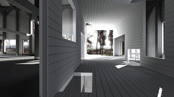
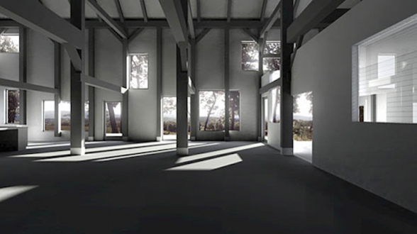
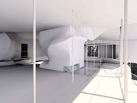
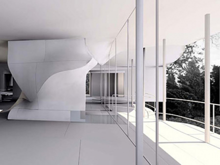
Toroidal Barn' - Goodman House (No. 1), 2001. Digital Duraflex print, edition of 6 (+2 AP), 27 x 48 in. The Goodman House contains an early 19th century Dutch barn structure that was moved from its original site. The clients' affection for the antiquated timbers combined with their desire for an excessively lit and predominantly undivided interior requires the radical segregation of three structural systems: the load bearing timbers, a steel frame providing lateral stability/rigidity, and a balloon frame enclosure. Nostalgia causes the emergence of a Modernist paradigm of construction more fitting to a commercial building than to a house. The image of the barn had been the gable form, the frame was hidden in the hay filled darkened interior. But today, an exposure fantasy has inverted this condition; while the gabled form is taken for granted, the frame becomes the primary feature. Thus, the Goodman house turns outside in: the interior and exterior are as if two mutually exclusive, interlocked spaces. The enclosure of the house contains as well as passes through the timber and steel frames that support it. This is because the outer surface of the volume extends into a hollow core that traverses the width of the house. On the exterior, the core is a wind chamber. From inside the house, it appears to be a giant inhabitable structural beam that occupies, as well as justifies (after the fact), an anomalous structural bay that was added to the original structure in the early twentieth century. If the Martin Bomber plant, designed by Albert Kahn in Mies Van der Rohe's Concert Hall Collage (1942), was an extraordinarily large space given that it was without supports for the roof, the Goodman barn is as overblown and monumental relative to its domestic program. The two structural origins are comparably unrefined and functional. But whereas Kahn's factory was evidence of a newfound possibility of modern steel construction to enclose monumental space (with the implication of dematerialization), today's Dutch barn renovations represent a desire to supplant lightweight balloon frame construction with obsolete, excessively robust posts and beams. Location: Pine Plains, NY Project Credits Chris Hoxie, k+d.lab (renderings) Project Team: Preston Scott Cohen (design); Kay Vorderwuelbecke, Wynne Mun, Alexis Duval-Arnould (assistants) Consultants: Donald Montgomery (structural); Jack Sobon (Dutch barn specialist); Jim Murphy (landscape); Vince Varriale (construction consultant) Client: Arnold and Elise Goodman Toroidal Barn' - Goodman House (No. 1), 2001. Digital Duraflex print, edition of 6 (+2 AP), 27 x 48 in.

The Goodman House contains an early 19th century Dutch barn structure that was moved from its original site. The clients' affection for the antiquated timbers combined with their desire for an excessively lit and predominantly undivided interior requires the radical segregation of three structural systems: the load bearing timbers, a steel frame providing lateral stability/rigidity, and a balloon frame enclosure. Nostalgia causes the emergence of a Modernist paradigm of construction more fitting to a commercial building than to a house.

The image of the barn had been the gable form, the frame was hidden in the hay filled darkened interior. But today, an exposure fantasy has inverted this condition; while the gabled form is taken for granted, the frame becomes the primary feature. Thus, the Goodman house turns outside in: the interior and exterior are as if two mutually exclusive, interlocked spaces. The enclosure of the house contains as well as passes through the timber and steel frames that support it. This is because the outer surface of the volume extends into a hollow core that traverses the width of the house. On the exterior, the core is a wind chamber. From inside the house, it appears to be a giant inhabitable structural beam that occupies, as well as justifies (after the fact), an anomalous structural bay that was added to the original structure in the early twentieth century.

If the Martin Bomber plant, designed by Albert Kahn in Mies Van der Rohe's Concert Hall Collage (1942), was an extraordinarily large space given that it was without supports for the roof, the Goodman barn is as overblown and monumental relative to its domestic program. The two structural origins are comparably unrefined and functional. But whereas Kahn's factory was evidence of a newfound possibility of modern steel construction to enclose monumental space (with the implication of dematerialization), today's Dutch barn renovations represent a desire to supplant lightweight balloon frame construction with obsolete, excessively robust posts and beams.

Location: Pine Plains, NY

Project Credits
Chris Hoxie, k+d.lab (renderings)
Project Team: Preston Scott Cohen (design); Kay Vorderwuelbecke, Wynne Mun, Alexis Duval-Arnould (assistants)
Consultants: Donald Montgomery (structural); Jack Sobon (Dutch barn specialist); Jim Murphy (landscape); Vince Varriale (construction consultant)
Client: Arnold and Elise Goodman
Toroidal Barn' - Goodman House (No. 2), 2001. Digital Duraflex print, edition of 6 (+2 AP), 27 x 48 in. Toroidal Barn' - Goodman House (No. 2), 2001. Digital Duraflex print, edition of 6 (+2 AP), 27 x 48 in.
Toroidal Barn' - Goodman House (No. 3), 2001. Digital Duraflex print, edition of 6 (+2 AP), 27 x 48 in. Toroidal Barn' - Goodman House (No. 3), 2001. Digital Duraflex print, edition of 6 (+2 AP), 27 x 48 in.
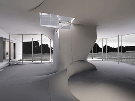
Torus' - Wolf House (No. 1), 1999. Digital Duraflex print, edition of 6 (+2 AP), 24 x 32 in. A toroid is a continuous surface generated by a circle swept along the path of a larger circle. The result is a surface that contains a volume shaped like a donut. In Torus House, orthogonal features and a curvilinear element allude to the torus and to historically pervasive types within architecture - the courtyard, empluvium, stairwell, light well. A curving line crosses several flat surfaces - walls, floors and ceiling - causing them to undulate the straight lines between these otherwise conventional surfaces break along the curving line and appear to be folds in a single surface rather than normative orthogonal intersections between separate planes. The client, a landscape painter, often entertains and paints on his roof. Upon parking under the Torus House, guests may walk up the spiral staircase contained in the core, by-pass the interior of the house, arrive on the roof, and survey the landscape. This sequence recalls the voyeuristic pleasure of an invited guest to an outdoor party who arrives by passing though an empty house on the way to backyard festivities. In addition, it evokes another experience - that of an observation tower. Yet, in this case the vertical passageway is relatively short and hovers above the ground. It is as if a tower had been compressed causing its top and bottom to splay into undulating horizontal surfaces. The interior of the main body of the house can thus be understood as the interval in a threshold between roof and ground landscapes. The actual threshold into the interior of the house is a ramped foyer that passes between the living space and the painter's workshop. The foyer ceiling is formed by a ramp in the studio which terminates in a landing that also serves as a kitchen table. There, a bench allows one to sit at the table suspended over the end of the foyer. It is as if one can occupy the kitchen, the foyer, and the studio, at once with a bifurcated view of the living room and easel painting studio. The living quarters are compact spaces adjacent to the two studios. The kitchen, office, bedrooms, bathrooms, laundry/storage/mechanical rooms yield maximum square footage to the two primary spaces and thus recall the space-saving arrangements devised for the client's Manhattan apartment. Three bedrooms, each of different character, accommodate different programmatic and seasonal changes. The upper bedroom, the most private, has its own bathroom and direct access to the studio workshop, kitchen and laundry. In conjunction with these rooms it comprises the portion of the house heated separately for year round use. During the warmer months, the easel painting studio doubles as a living room and in the winter may be used as a gallery. A bedroom extends from this space like a deeply recessed window seat. The floor of the bedroom becomes the platform for a bed placed directly next to the studio/living room. The third bedroom is like a sleeping porch that cantilevers beyond the outer edge of the living room terrace. Program: A 3,104 square foot house and studio for artist Eric Wolf in Columbia County, New York. The site is hilly. Woods alternate with open fields subdivided by rubble walls. Primary materials: Poured-in-place concrete foundation. Steel columns support laminate wood structural ribs. Exterior cladding: sheet metal, lapped and attached with cleats, and soldered at seams and edges. Interior cladding: Strip plank hard wood in main room. Dry wall, plywood, and tile in other areas. Location: Columbia County, NY Project Credits Chris Hoxie (renderings) Project Team: Preston Scott Cohen (design); Alexandra Barker, Chris Hoxie, Eric Olsen (assistants); Aaron d'Innocenzo, Judy Hodge (model) Consultants: Jon Elmaleh (structural); Andrew Grossman (landscape); d.h.e. Co. and EEE, Inc. (general contractors) Client: Eric Wolf Progressive Architecture Award, 2000 Torus' - Wolf House (No. 1), 1999. Digital Duraflex print, edition of 6 (+2 AP), 24 x 32 in.

A toroid is a continuous surface generated by a circle swept along the path of a larger circle. The result is a surface that contains a volume shaped like a donut. In Torus House, orthogonal features and a curvilinear element allude to the torus and to historically pervasive types within architecture - the courtyard, empluvium, stairwell, light well. A curving line crosses several flat surfaces - walls, floors and ceiling - causing them to undulate the straight lines between these otherwise conventional surfaces break along the curving line and appear to be folds in a single surface rather than normative orthogonal intersections between separate planes.

The client, a landscape painter, often entertains and paints on his roof. Upon parking under the Torus House, guests may walk up the spiral staircase contained in the core, by-pass the interior of the house, arrive on the roof, and survey the landscape. This sequence recalls the voyeuristic pleasure of an invited guest to an outdoor party who arrives by passing though an empty house on the way to backyard festivities. In addition, it evokes another experience - that of an observation tower. Yet, in this case the vertical passageway is relatively short and hovers above the ground. It is as if a tower had been compressed causing its top and bottom to splay into undulating horizontal surfaces. The interior of the main body of the house can thus be understood as the interval in a threshold between roof and ground landscapes.

The actual threshold into the interior of the house is a ramped foyer that passes between the living space and the painter's workshop. The foyer ceiling is formed by a ramp in the studio which terminates in a landing that also serves as a kitchen table. There, a bench allows one to sit at the table suspended over the end of the foyer. It is as if one can occupy the kitchen, the foyer, and the studio, at once with a bifurcated view of the living room and easel painting studio.

The living quarters are compact spaces adjacent to the two studios. The kitchen, office, bedrooms, bathrooms, laundry/storage/mechanical rooms yield maximum square footage to the two primary spaces and thus recall the space-saving arrangements devised for the client's Manhattan apartment. Three bedrooms, each of different character, accommodate different programmatic and seasonal changes. The upper bedroom, the most private, has its own bathroom and direct access to the studio workshop, kitchen and laundry. In conjunction with these rooms it comprises the portion of the house heated separately for year round use. During the warmer months, the easel painting studio doubles as a living room and in the winter may be used as a gallery. A bedroom extends from this space like a deeply recessed window seat. The floor of the bedroom becomes the platform for a bed placed directly next to the studio/living room. The third bedroom is like a sleeping porch that cantilevers beyond the outer edge of the living room terrace.

Program: A 3,104 square foot house and studio for artist Eric Wolf in Columbia County, New York. The site is hilly. Woods alternate with open fields subdivided by rubble walls.
Primary materials: Poured-in-place concrete foundation. Steel columns support laminate wood structural ribs. Exterior cladding: sheet metal, lapped and attached with cleats, and soldered at seams and edges. Interior cladding: Strip plank hard wood in main room. Dry wall, plywood, and tile in other areas.

Location: Columbia County, NY

Project Credits
Chris Hoxie (renderings)
Project Team: Preston Scott Cohen (design); Alexandra Barker, Chris Hoxie, Eric Olsen (assistants); Aaron d'Innocenzo, Judy Hodge (model)
Consultants: Jon Elmaleh (structural); Andrew Grossman (landscape); d.h.e. Co. and EEE, Inc. (general contractors)
Client: Eric Wolf

Progressive Architecture Award, 2000
Torus' - Wolf House (No. 2), 1999. Digital Duraflex print, edition of 6 (+2 AP), 24 x 32 in. Torus' - Wolf House (No. 2), 1999. Digital Duraflex print, edition of 6 (+2 AP), 24 x 32 in.
Torus' - Wolf House (No. 3), 1999. Digital Duraflex print, edition of 6 (+2 AP), 24 x 32 in. Torus' - Wolf House (No. 3), 1999. Digital Duraflex print, edition of 6 (+2 AP), 24 x 32 in.

Preston Scott Cohen

Toroidal Architecture
November 3 - December 22, 2001

Preston Scott Cohen – Toroidal Architecture Press Release

Thomas Erben Gallery is very pleased to announce an exhibition by architect Preston Scott Cohen entitled Toroidal Architecture, featuring digital renderings and diagrams of interior spaces from three proposals.

The overriding idea uniting the different projects is that of a torus, a donut shaped figure, in which the outside traverses the center reversing the familiar relation between inside and outside. Thus, for example, the core of the Torus House contains a stair allowing one to pass from a parking platform below the house directly unto the roof without entering the inside.

In Cohen’s second stage competition entry for Eyebeam Atelier’s Museum of Art and Technology, New York, 2001, the toroidal space takes the shape of cones and cylinders intersecting one another. The resulting sensuous curves animate the otherwise minimal building and illicit biomorphic and maritime associations. The Goodman House, a relocated 18th century barn structure, is enveloped in a structural steel case which in turn is housed in a third skin which penetrates the voluminous interior in a toroidal manner.

The skewer like structures in Eyebeam may recall the arrows shot in St. Sebastian’s body and the slight shifts in scale and arrangement of windows in the Goodman House, a Hopperesque or Hitchcockian atmosphere. These references reflect the architect’s broad interests which, in this exhibition, appear primarily focused on baroque geometry, cinematic montage and early twentieth century realism.

Finally, Cohen’s extensive use of computer technology integrates a heretofore perceived contradiction. Since blob-like biomorphic structures thus far evaded mathematical calculation, they were seen as opposed to modernist ideas of structure and function. He uses available digital media to mathematically describe irregular forms and fuses them with modernist architectural principles.

Preston Scott Cohen is considered to be one of the most interesting emerging architects in the United States. Associate Professor at Harvard Design School, he is author of Contested Symmetries and Other Predicaments in Architecture (Princeton Architectural Press, 2001). Recent projects include short list design proposals for the Temporary Museum of Modern Art and the Eyebeam Atelier, Museum of Art and Technology, both in New York. His work and research has been published widely internationally. Recent exhibitions include Folds, Blobs and Boxes at the Carnegie Museum of Art (2001) and The Un-Private House at The Museum of Modern Art in New York (1999) which recently acquired the Torus House model for their collection.
 

Reviews

Reviews

back to top